Project Title:
Design Bubble – AI Web Encyclopedia
Role:
UX/UI Designer
Timeline:
4 weeks, November-December 2024
Tools:
Figma, Figjam, Adobe Photoshop
Background
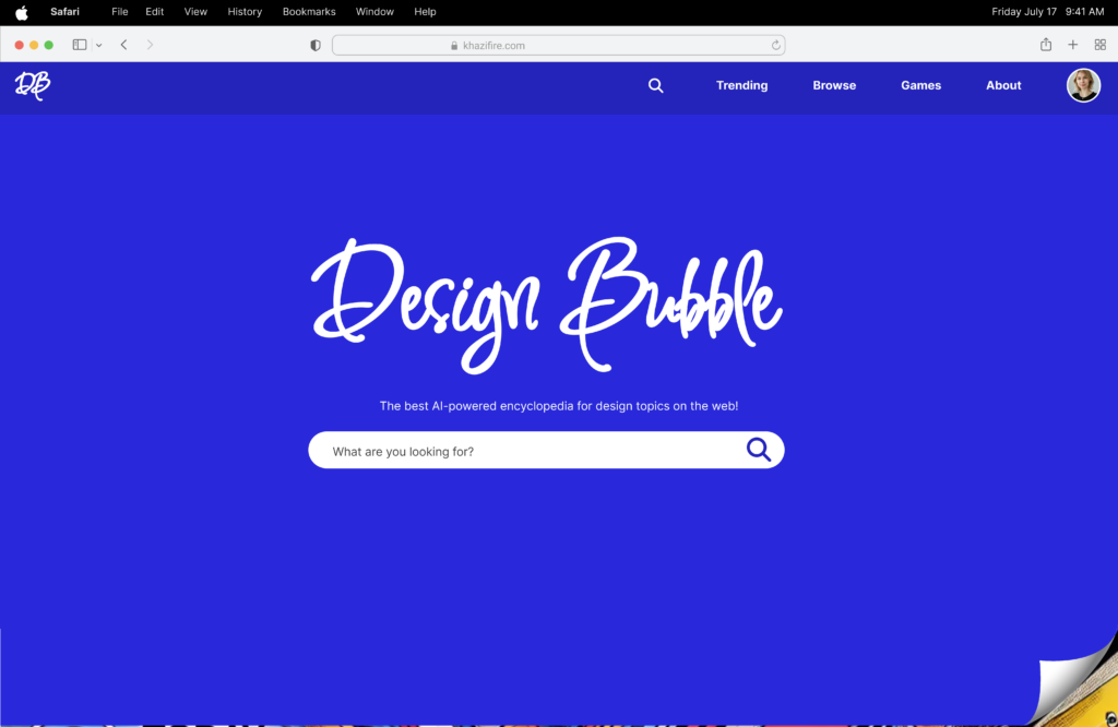
As a former design teacher, I witnessed how students struggled to find trustworthy, educational, and engaging design content. Resources like Dribbble, YouTube, Wikipedia, and ChatGPT each offered value — but they were fragmented, inconsistent, and often overwhelming for beginners. Design Bubble was born out of this pain point: a centralized tool that helps users discover the best content related to design topics through a clean, focused interface.
The Problem
“Design learners often struggle to find clear, trustworthy, and curated content when researching design topics. While great content exists on the internet, this information is scattered across various platforms with inconsistencies in quality.”
User Research
My background experience in the classroom helped guide my creation of user personas, flows, and UI decisions. I saw how my students were frustrated with the process of finding quality resources for design topics.

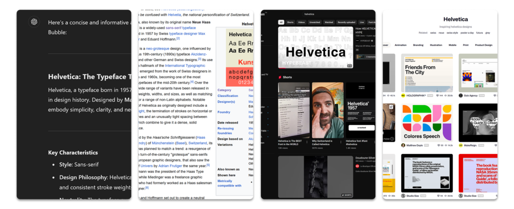
Each platform had its strengths and weaknesses, which required the use of multiple apps to research a topic.
I began with a user persona generated by AI, but quickly realized it lacked the nuance and authenticity I’d seen in real students. Drawing from years in the classroom, I refined it based on actual student behavior — especially those who were overwhelmed by scattered resources or lacked a design background. This was an important lesson in using AI as a starting point, not a substitute for real empathy and lived observatio
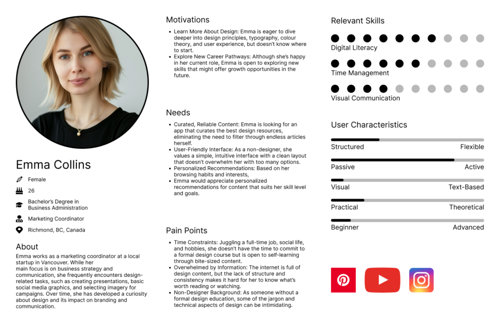
with either true user tests or in the case of this project, my firsthand observations of students.
Wireframes & Prototypes
Starting with some rough sketches, I got an idea for how I would compile images, videos, and text on the design topics that the user searches for. From there, I went into the creation of a high fidelity prototype. I put a lot of time and work into this version of the prototype, but as you’ll see in the next section, much of the content I created didn’t end up in the final version after user testing, feedback, and my own heuristic analysis.
This was a valuable lesson for me not to jump into something so detailed so quickly. I should have approached this project with a very simple prototype to test with my users, rather than get bogged down by small visual details that ended up being completely wasted.
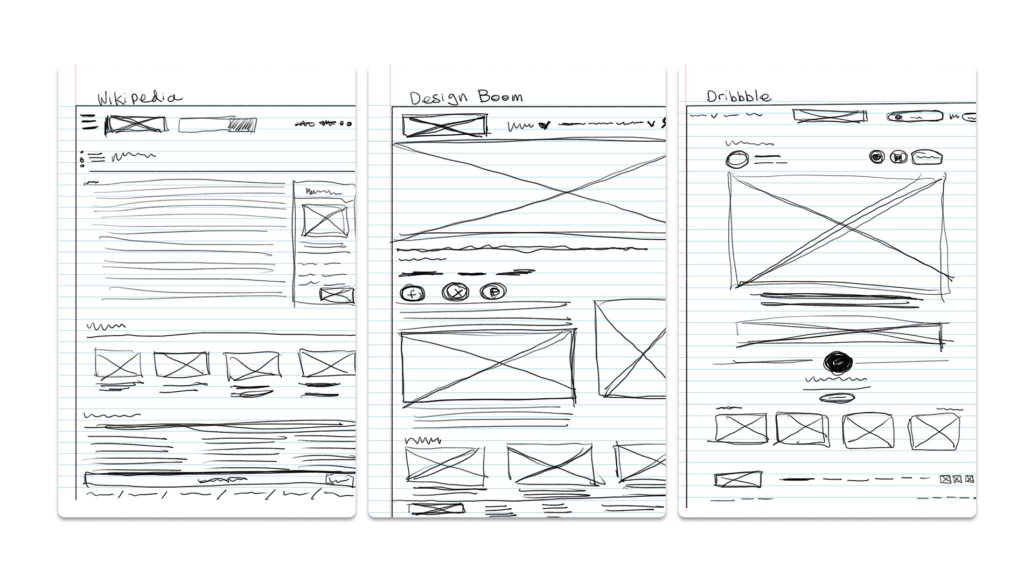
interface elements were the best at presenting design content.
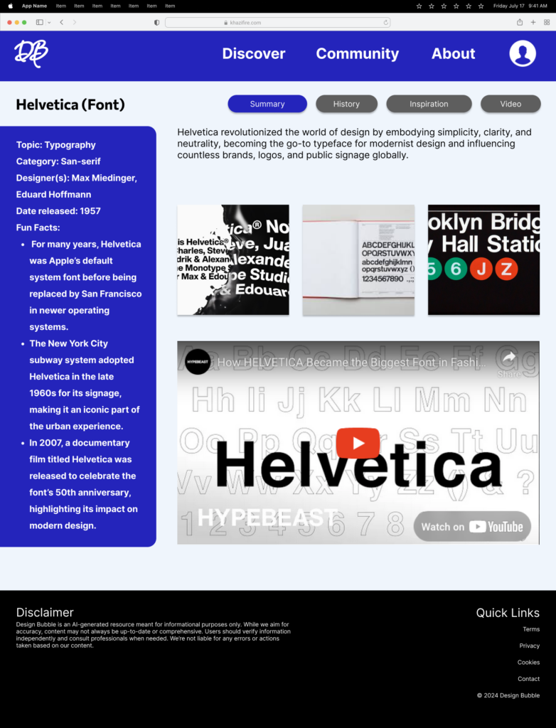
ultimately ended up being more work for mas I spent a lot of time in elements of my design that was eventually removed.
User Testing
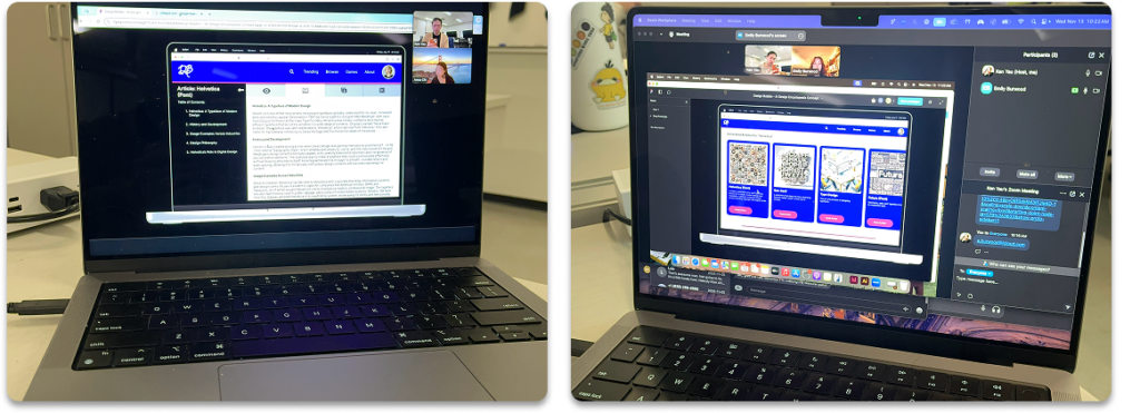
After I completed the initial high fidelity prototype, I conducted user tests with my design friends. We did a think aloud where they went through the app and explained their thought process to me. Out of all of the steps throughout this project, this was easily the most beneficial part of the entire exercise to me. This informed me of the importance of user testing, and getting real, tangible feedback that you can observe on your designs.
It was at this point of the process that I observed that there were certain elements within my design that while I thought were clear, it was clear that what I wanted to convey didn’t exactly work out as planned. For example, I originally planned for the various tabs in the article page to use simple icons to represent summary, video, and gallery. What I realized was that these icons didn’t clearly convey what was in those tabs, which led to use user frustrations when the results did not meet their expectations. This was a reminder for me that ultimately we are designing for.our user. While the tabs with the icons was visually appealing to me, it did not meet it’s intended purpose.
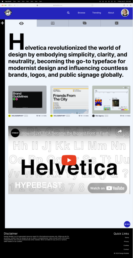
would have been effective in representing the “overview” page, but that really wasn’t clear for my users.
The Final
In the end, I took the user feedback and testing to create a final product that addressed the concerns at issues I observed. I also went through a further heuristic analysis of my design and identified additional issues. For example, the scale of my entire interface was too large, and needed to be reduced. What I learned from this is that both the test and the analysis should have been conducted long before I went into so much detail to create high fidelity functions and components. The end result was lots of wasted time and assets. This project really taught me the importance of user tests and releasing an MVP to test before diving too deep into the details!
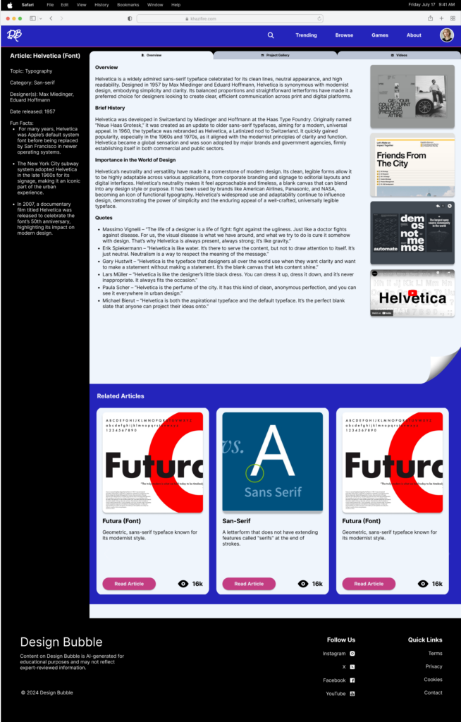
keeping in mind Hick’s law.
Reflection & Next Steps
This project taught me the value of designing with empathy and restraint. I initially rushed to high-fidelity visuals but I learned to slow down and ground decisions in real feedback. I also saw how tools like AI and community templates can help, but not replace critical thinking. Most importantly, I was reminded that great UX is not about showing off — it’s about showing up for your user.
I may continue to develop this design further. My next steps would be to create a mobile interface for Design Bubble, and explore how I can produce the same concept functionality on a much smaller screen size. I would also work on creating a more responsive interface within Figma, so that the app can work on various screen sizes.